
The Charter
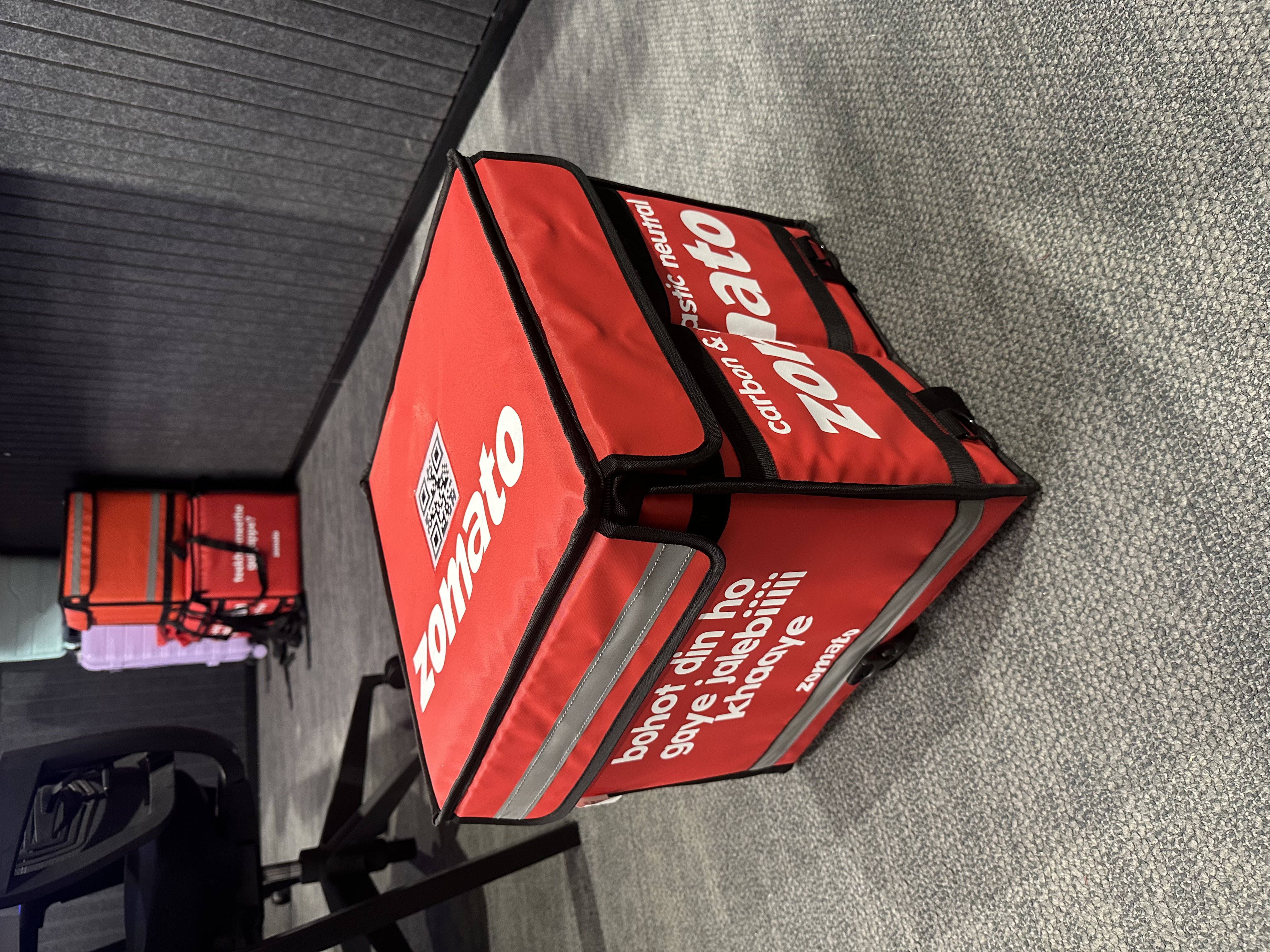
At Zomato, the Logistics Cost charter sits at the intersection of rider economics, supply chain efficiency, and consumer delivery experience. For over a year, I owned the products that determined how 6 lakh+ delivery partners in India understood, earned, and were motivated by their incentives.
This was not just a design problem or a product problem. It was a behavioural problem. Getting a delivery partner to log in at peak hours, complete their gigs, avoid quality breaches, and stay motivated required a product system that spoke clearly, rewarded fairly, and communicated in a language every rider could understand.
The charter touched six product areas and a Rs 600 crore annual incentive budget. Every percentage point of offer achievement rate translated into crores saved or spent. And every unclear screen was a rider who gave up on their own earnings.
What I owned
The full charter
Offers
Designed and owned the full offer system for delivery partners, including Gig-Based Offers (GBO), Earnings-Based Offers (EBO), and Drop Incentives (DI). Built a behavioural targeting engine and nudge system to help riders understand, track, and achieve their incentives.
Payout and Pocket
Owned the end-to-end payout product: how riders get paid, transparency into earnings, tips and tip nudges, and EMI resurrection for lapsed riders. Reduced financial confusion and support contacts significantly.
Gigs
Owned the Gigs product: shift scheduling, supply-demand matching, and mandatory login flows. Ensured the right number of riders were available at the right time across India.
The process
End-to-end product lifecycle
Every product under this charter followed this lifecycle from conception to nationwide impact.
The problem
Riders could not understand their own offers
When I joined the Logistics Cost team, the offer experience for delivery partners was in a state of significant dysfunction. Riders were logging off mid-shift because they did not understand what they needed to do to earn their incentives. Support tickets were high. Offer achievement rates were low.
The problem was not a lack of offers. Zomato had a rich incentive system. The problem was that the product experience was so opaque and cluttered that riders could not see clearly what was in front of them.
No uniformity
Offer card designs lacked consistency across the rider experience, making the product feel unfinished and untrustworthy.
Not intuitive
Existing UX made it challenging for riders to understand what offers were available, what they needed to do, and what they would earn.
Cognitive overload
Excessive information was presented in cluttered conditions, overwhelming riders who were trying to make quick decisions on the road.
No audio or visual aids
There were no media elements to help riders comprehend offer details. For low-literacy riders, this made the product inaccessible.
No localisation
Offers were only available in English, excluding a large proportion of riders who primarily read Hindi or regional languages.
Broken layout
Overlapping text, misaligned elements, and poorly structured content made the offer cards visually broken in many scenarios.
Confusing status
Riders could not understand their progress, whether they had breached a condition, or whether they had achieved their offer.
No gratification
There were no nudges to encourage riders near completion and no celebration when riders successfully earned their offers.
Research
10+ cities, hundreds of riders, every geography
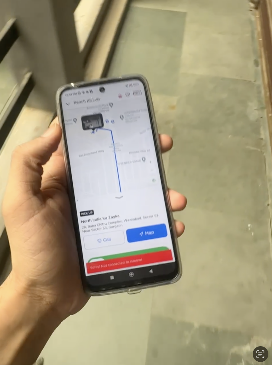
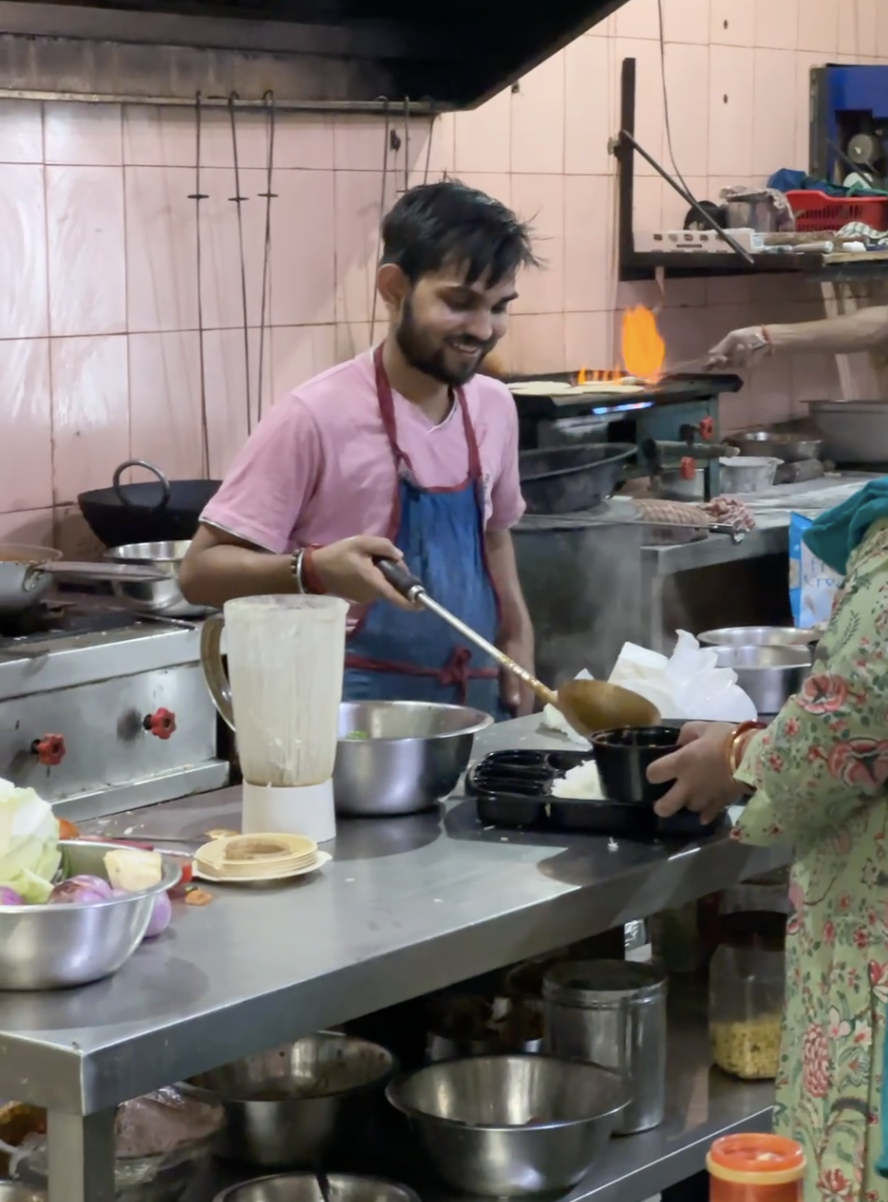
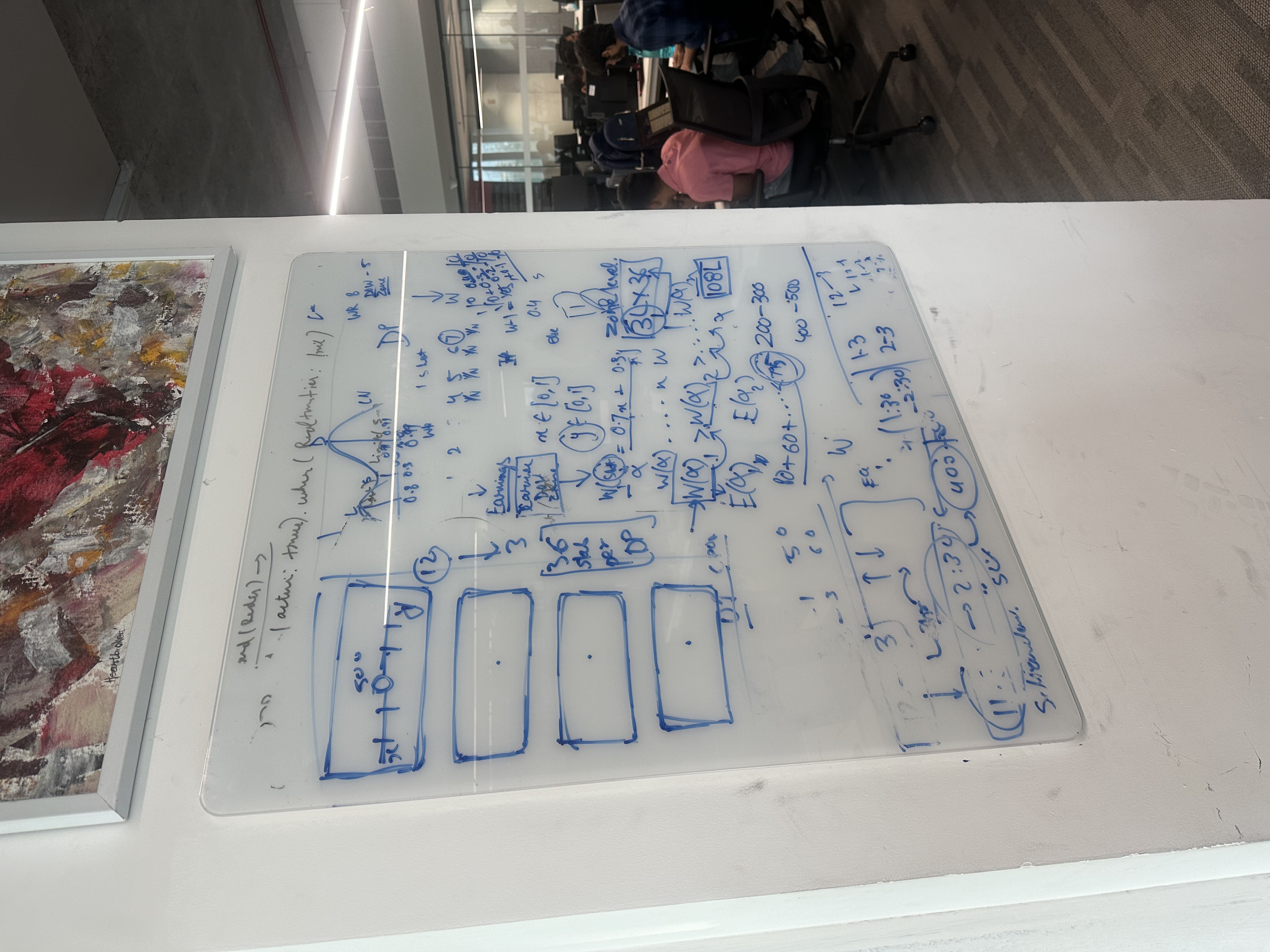
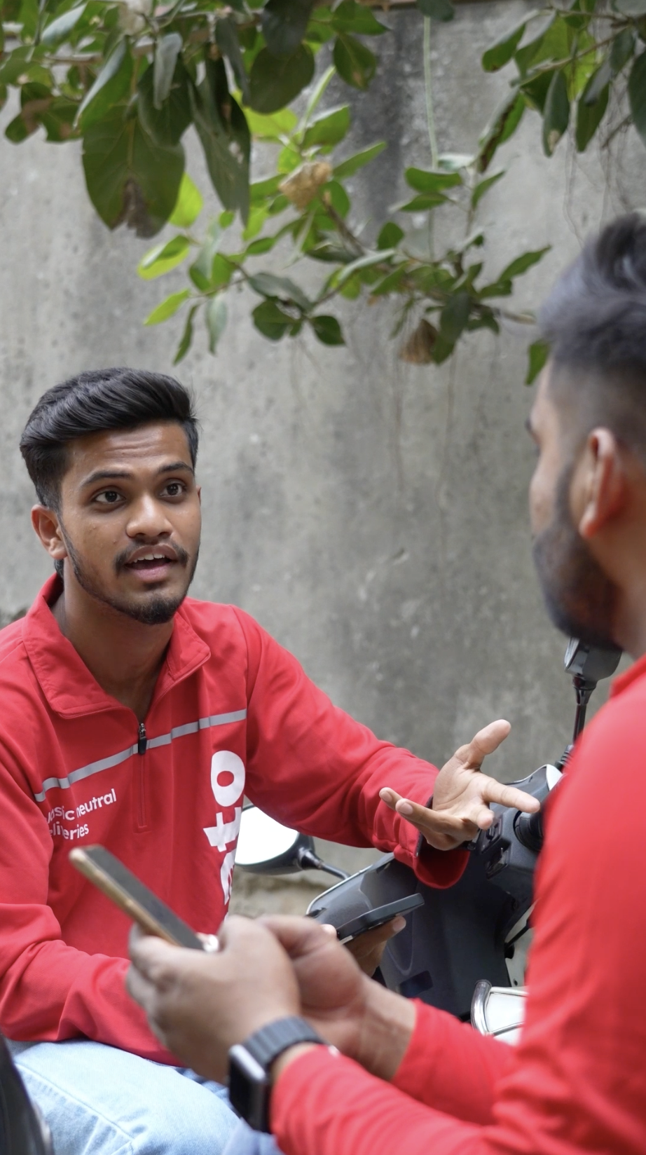
Before any solutioning, I spent weeks doing on-ground research with delivery partners, city ops leads, and city managers across India. The goal was to understand how riders actually thought about their offers, not how we assumed they did.
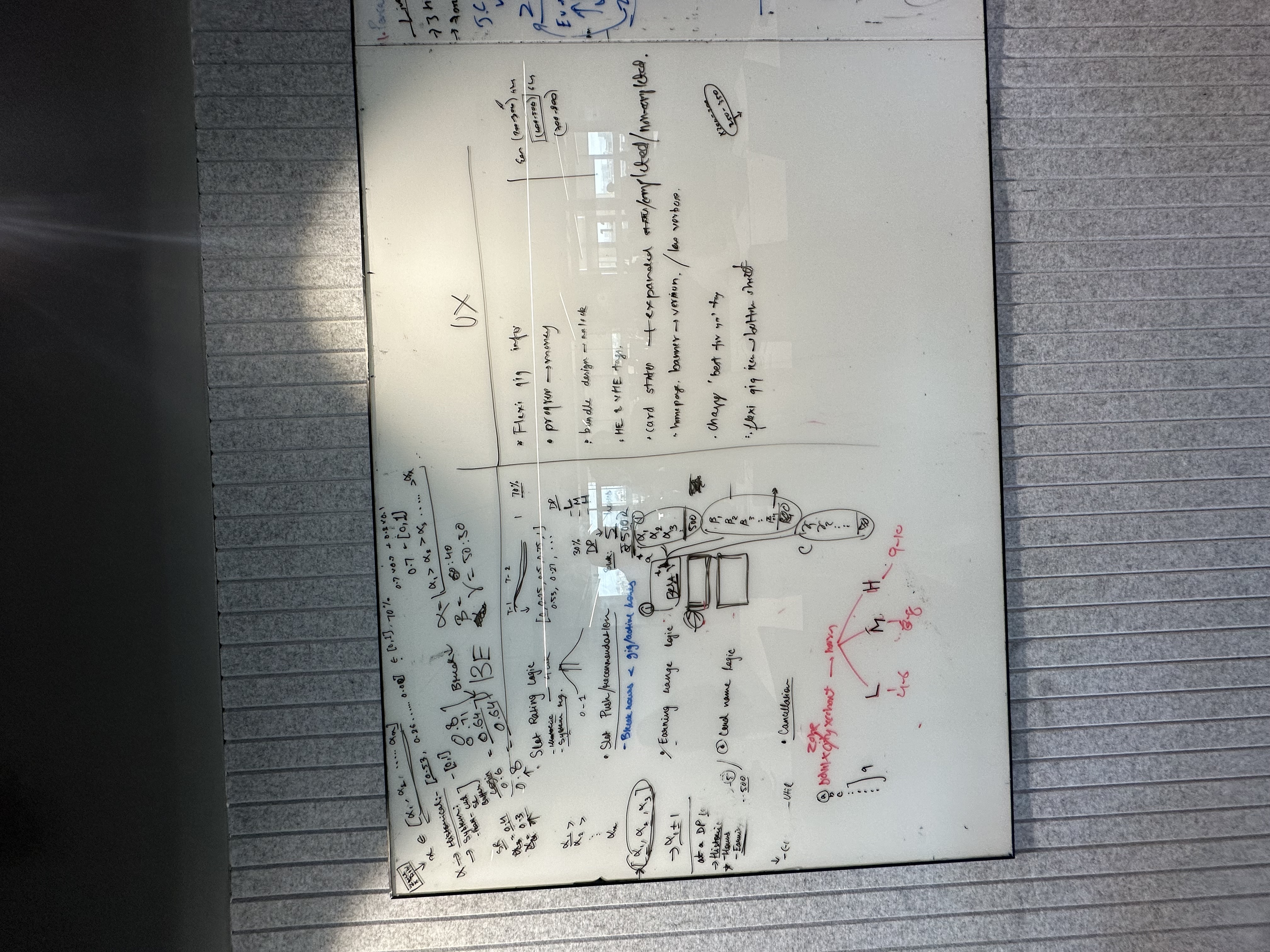
Research and Documentation Process


The solution
A unified offer experience built around clarity
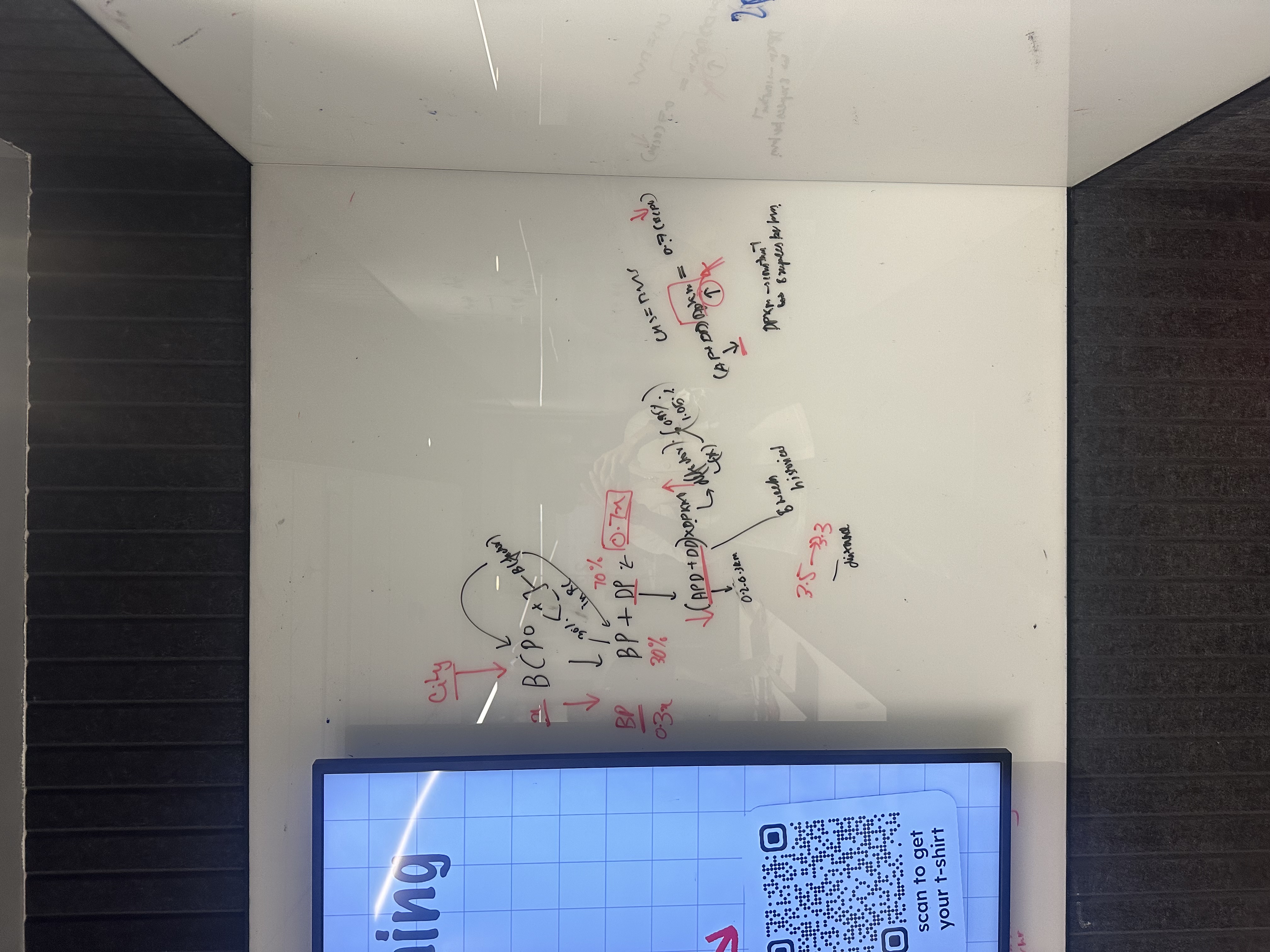
The research made it clear: the problem was not incentive design, it was communication design. Delivery partners understood the concept of earning more. They did not understand how, when, or whether they had succeeded.
The solution was a complete rebuild of the offer experience: a unified card design, a deterministic state machine, a nudge system that prioritised correctly, vernacular audio walkthroughs, and a copy framework written for people reading quickly on a phone in the middle of a shift.
Offer types
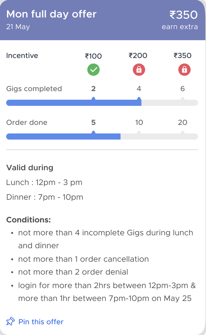
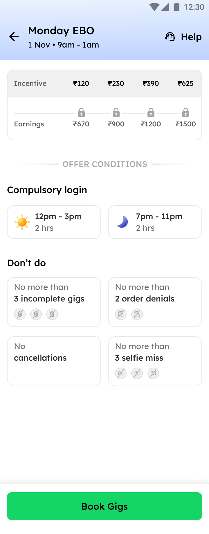
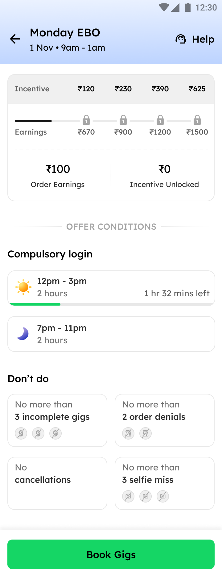
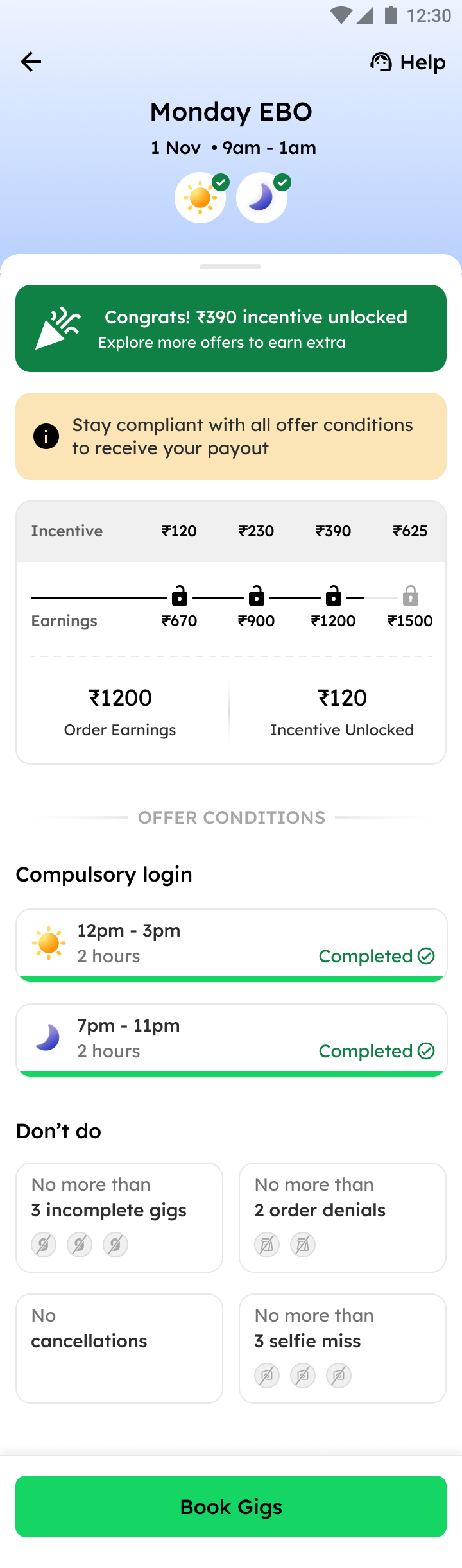
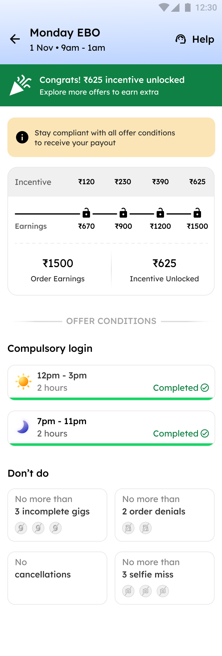
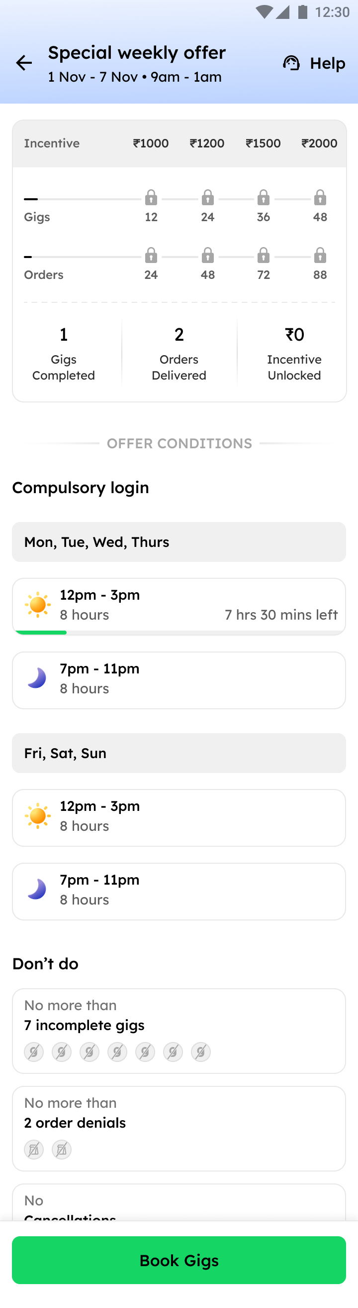
Three offer types, one unified design system
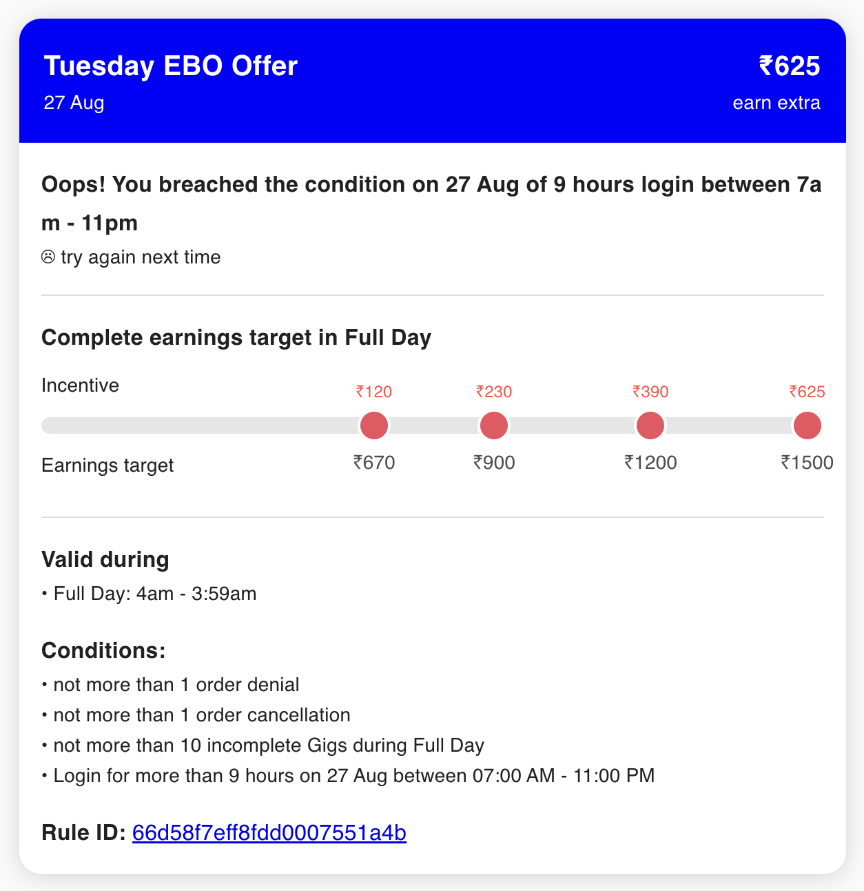
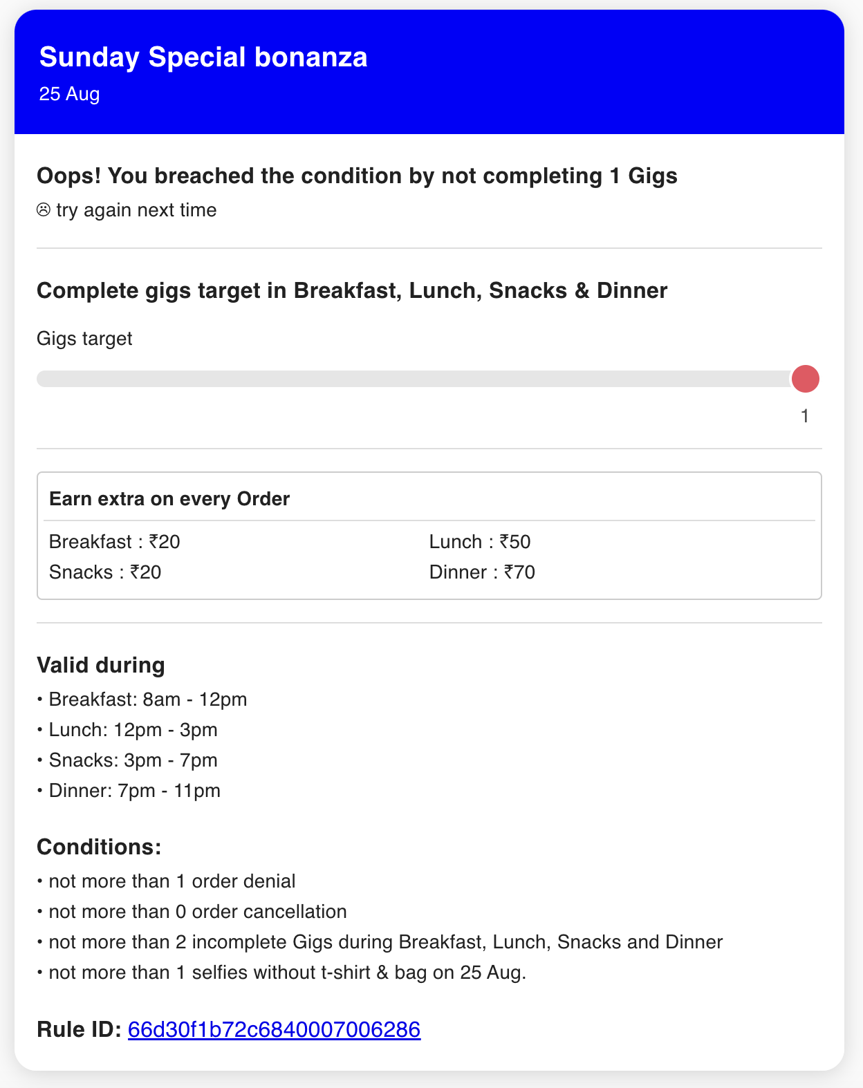
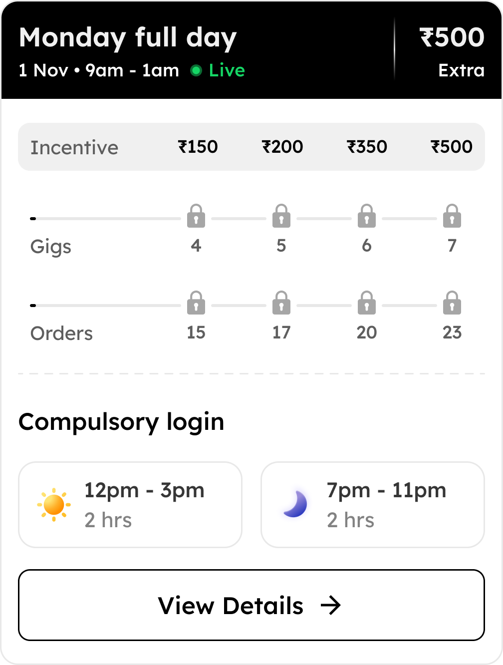
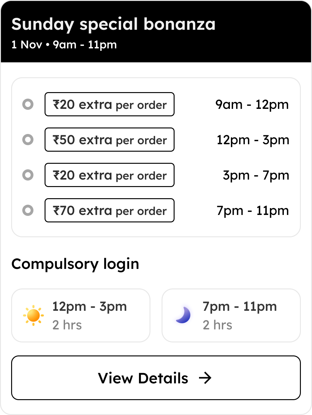
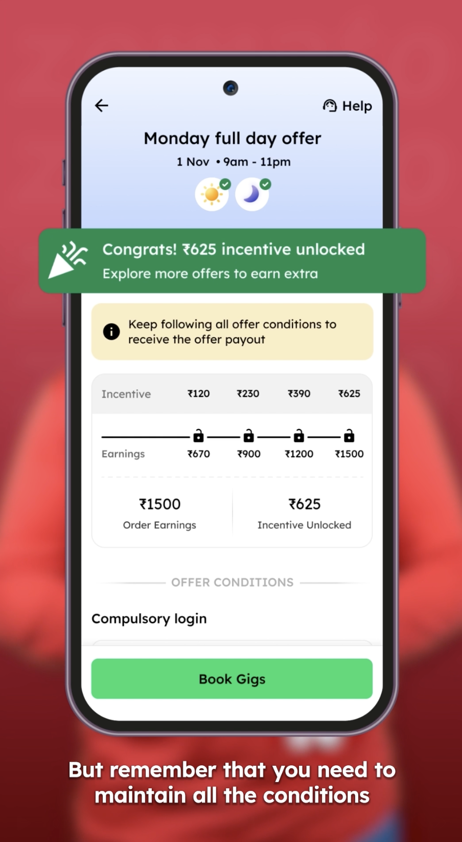
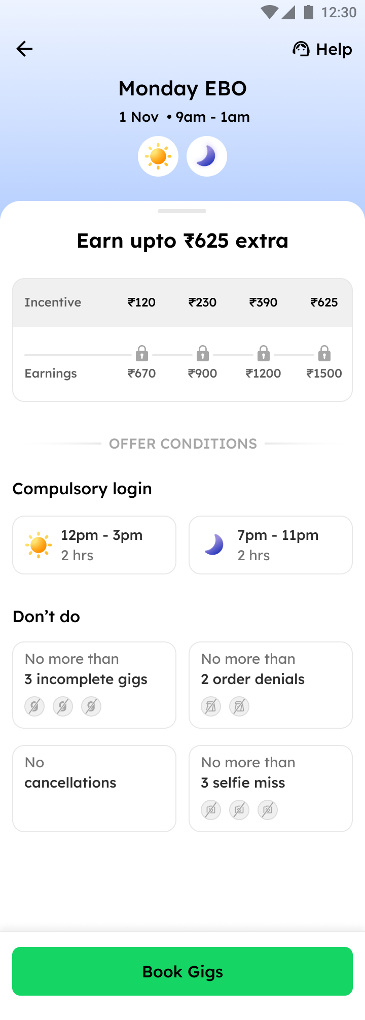
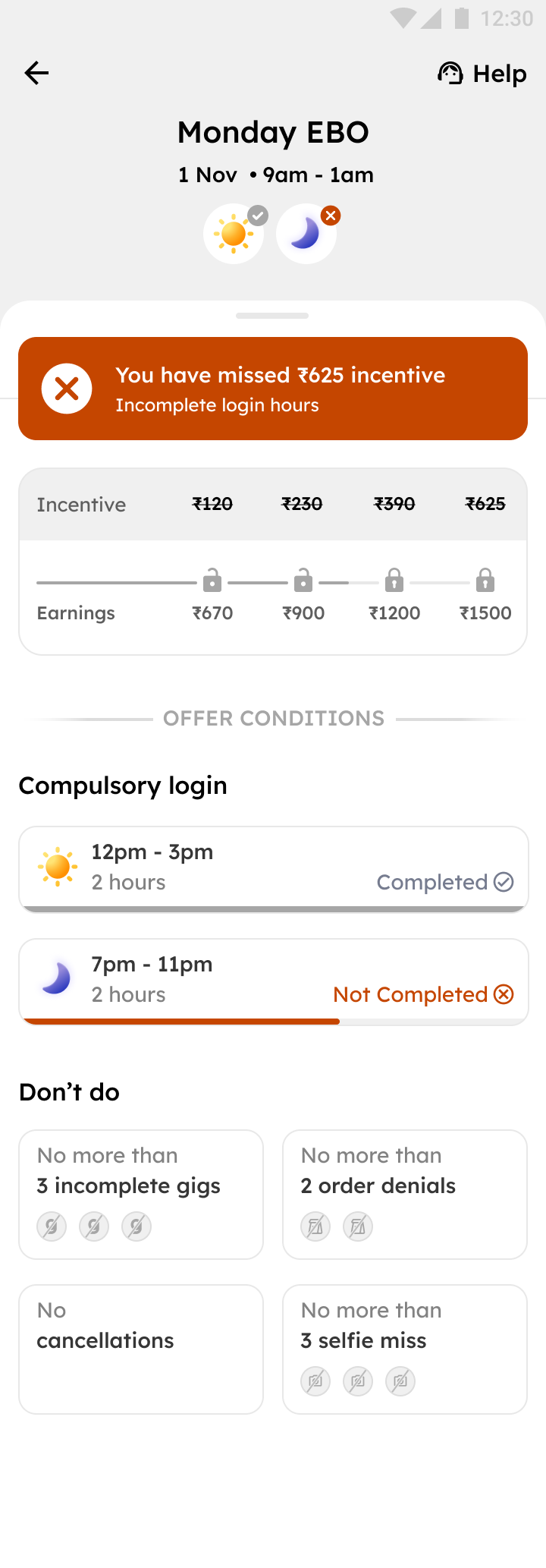
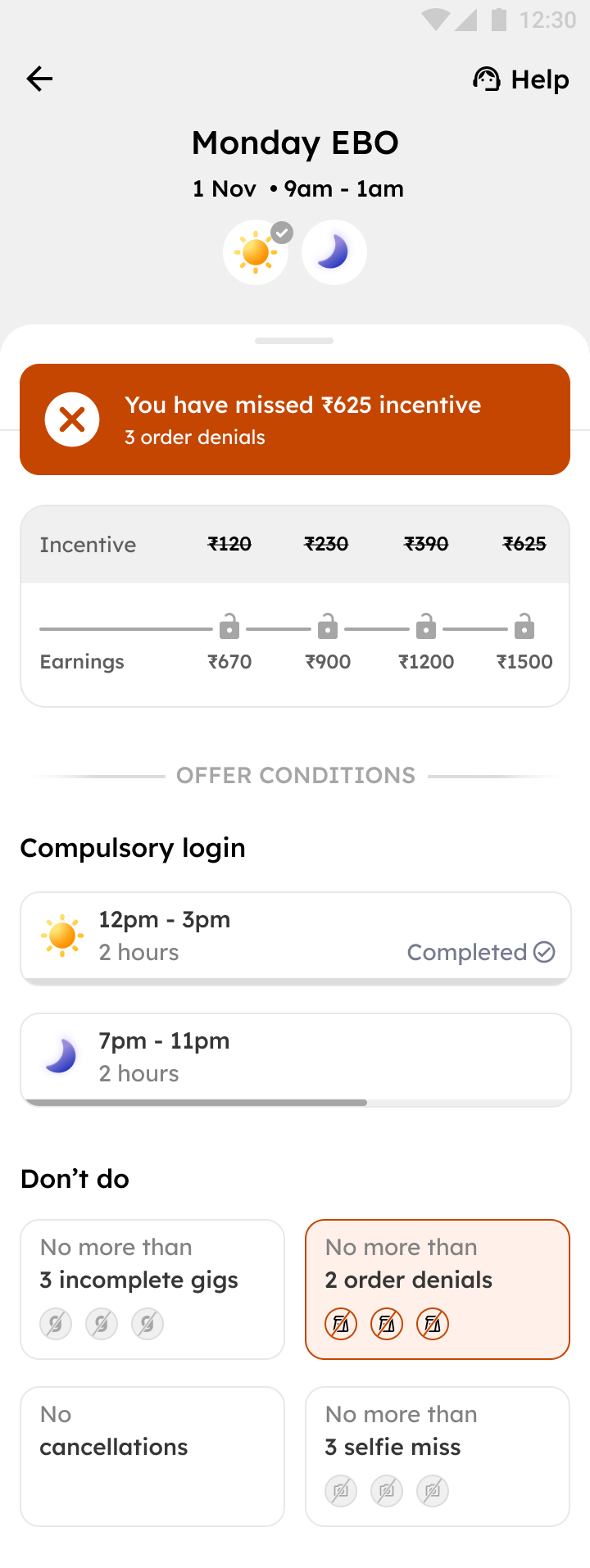
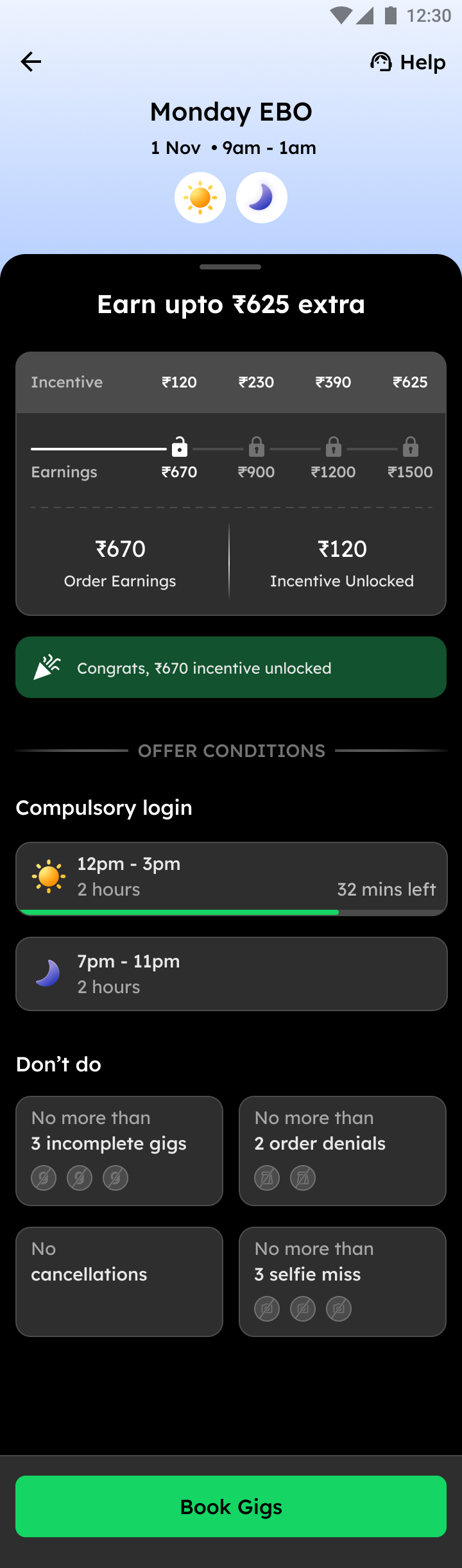
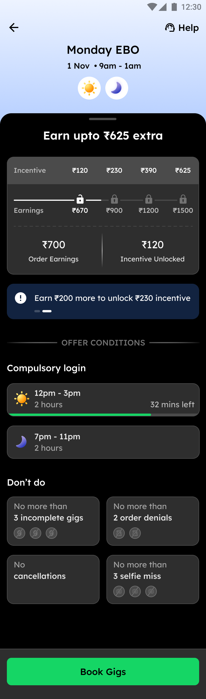
An incentive paid out based on the number of gigs and orders completed within a configured time slot. Riders must meet minimum login hour requirements across up to five meal times. Quality conditions apply, including limits on incomplete gigs. Mandatory login conditions may also apply on a weekly basis.
- Minimum login hours across up to 5 meal times
- Quality conditions (denials, cancellations, order ratings)
- Incomplete gigs cap
- Weekly mandatory login requirement
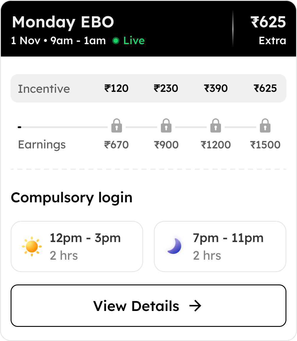
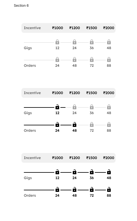
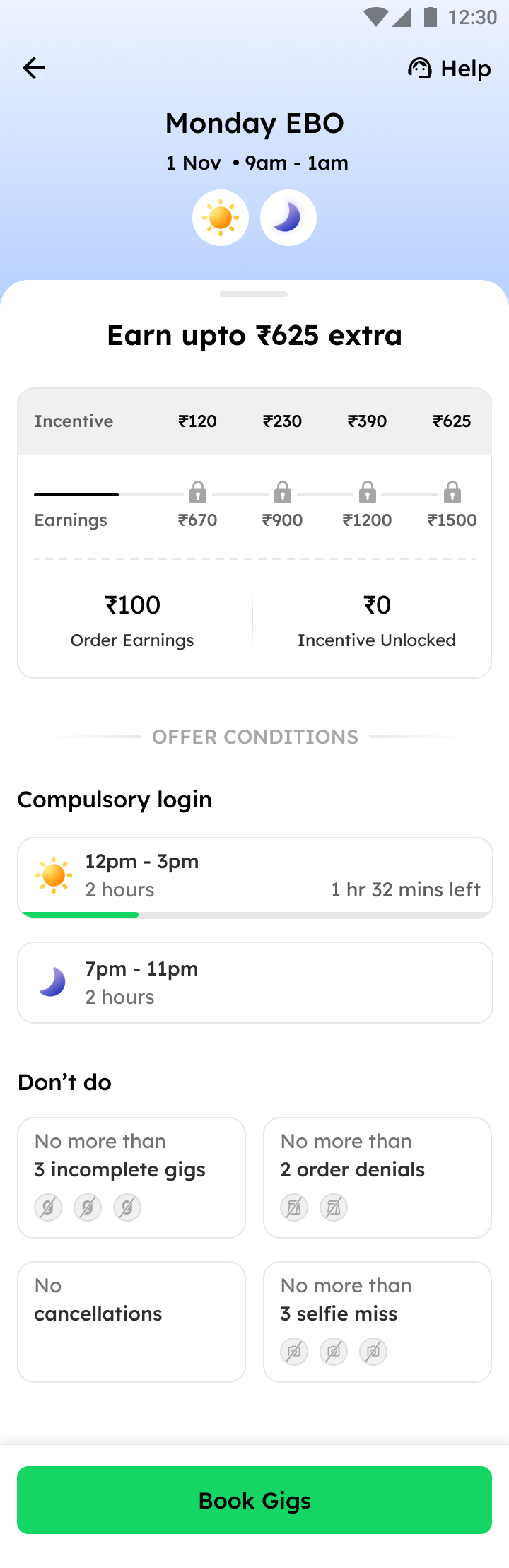
An incentive based on total order earnings within a configured period. Uses the same configurable quality conditions as GBO. Riders progress by meeting earning targets and unlocking slab-based payouts. Works best in markets where order volume is consistent.
- Total order earnings target
- Quality conditions (same as GBO)
- Slab-based progression
- Login hour requirement (configurable)
A per-order incentive that pays riders directly for each delivery completed during a configured time window. No minimum order milestone required. A login hour condition can be configured. Each order earns directly, making this the most immediately rewarding construct for riders.
- Per-order payout for each delivery
- No minimum order milestone
- Optional login hour condition
- Configurable time window
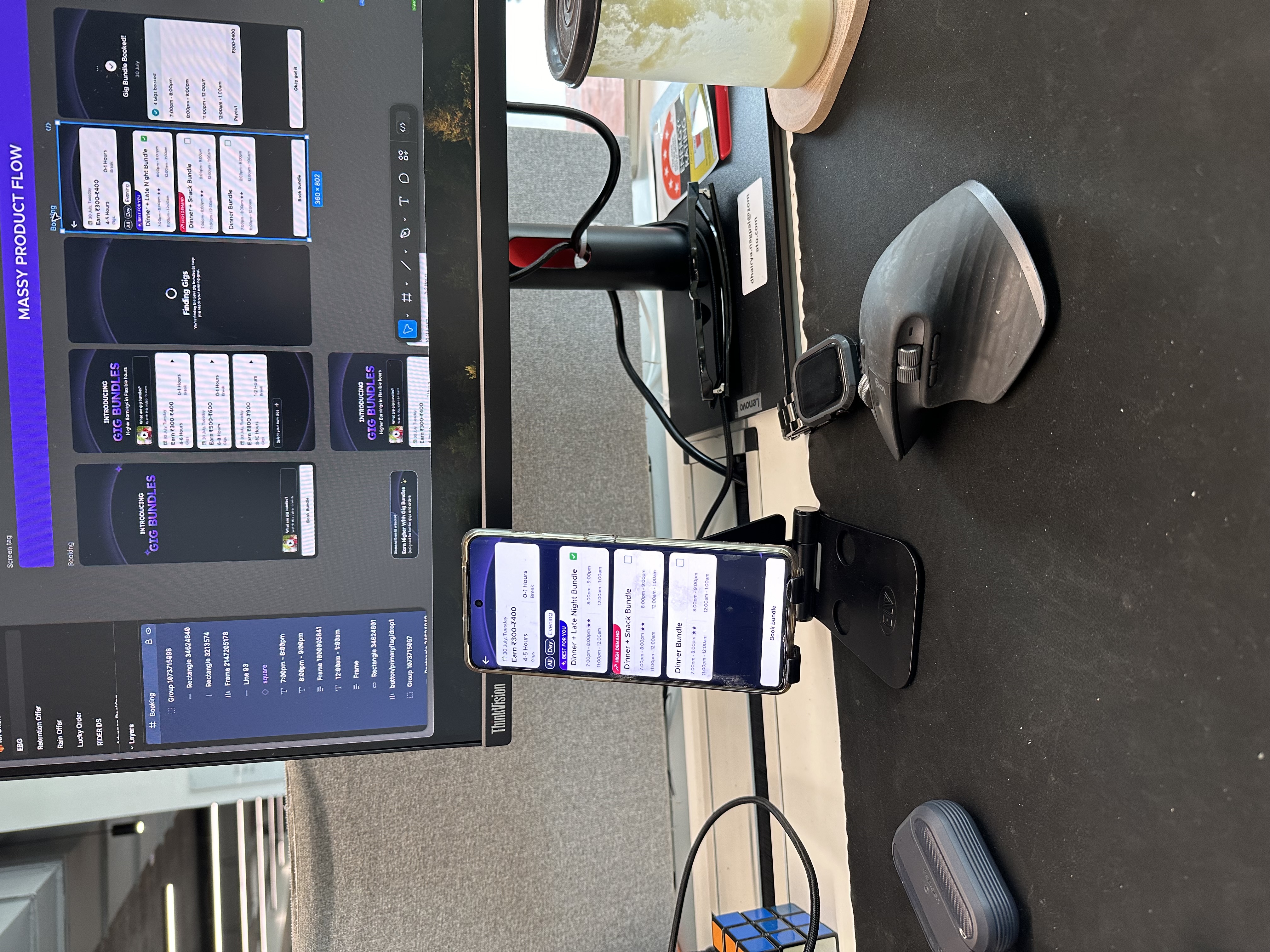
How each offer type looks in the app
Offer type comparison
State machine
Five states, zero ambiguity
One of the core design problems was that delivery partners could not tell what state their offer was in. Was it still active? Did they breach? Had they completed it? The old product had no deterministic answer.
The new system introduced five explicitly defined states, each with its own visual treatment, copy, and CTA logic. Every screen the delivery partner saw was tied to exactly one state. No ambiguity. No silent failures.
Offer is live and the rider is working towards it. Dynamic CTAs show the next steps the rider needs to take.
“Do X gigs and Y orders to unlock Rs Z”
All required tasks have been met. Quality conditions must still be maintained until the offer window closes.
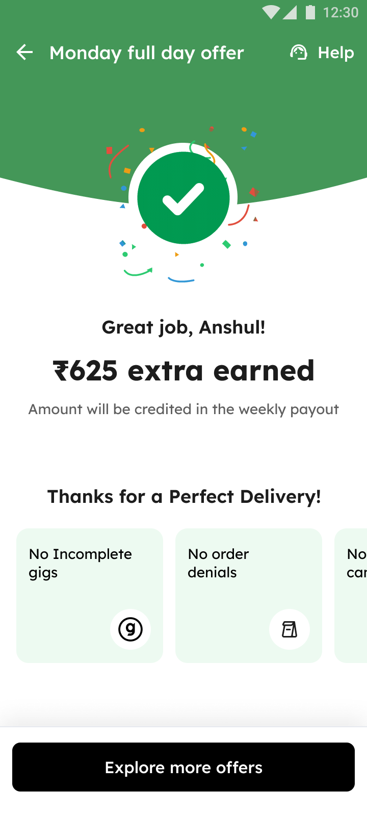
“Congrats! You have completed the offer. You have unlocked Rs X.”
All tasks and quality conditions have been maintained for the full period. The incentive amount is now locked in for payout.
“Congrats! You have earned Rs X extra.”
One or more critical conditions have been violated, resulting in loss of the offer incentive.
“You have missed Rs X incentive. More than X order denials.”
The offer end time has been reached without the rider making sufficient progress to qualify.
“This offer has expired. Explore other offers.”
Nudge system
Dynamic nudges: the right message at the right moment
At any point in time, a delivery partner might have multiple conditions active simultaneously. The system needed a clear priority hierarchy to decide which nudge to surface first, so that delivery partners always knew exactly what to do next.
Mandatory gigs or logins pending
When a mandatory condition is not yet met, this always surfaces first. Blocking the rider from ignoring it.
Positive next steps (next slab can be unlocked)
Motivational nudge when the rider is progressing and can unlock the next reward tier by continuing.
Preventive steps (denials or cancellations nearing breach)
Warning nudge when quality conditions are approaching the breach threshold, giving the rider a chance to course-correct.
Terminal state (offer condition achieved)
Confirmation nudge when the rider has completed all tasks. Celebrates the achievement and prompts next action.
Nudge examples


Nudge decision model
At every check-in, the system evaluates three questions in order. First: are compulsory conditions pending? Second: have gig and order targets been hit? Third: are quality thresholds approaching a breach? The first matching condition wins — and the appropriate nudge is triggered.
Offer sorting logic
The right offer, always at the top
When a delivery partner opens the offer list, there is no time to scroll and evaluate. The most important offer must be immediately visible. The sorting logic determined exactly what that order should be at every moment.
Sorting happened in two layers: first, a fixed priority tier by offer state; then within each tier, a configurable pinning or manual priority mechanism for operations to surface specific offers.
Sort within each tier, then by state priority
Active and Ongoing
Currently being worked on
Active and Pre-Breach
Near a quality breach threshold
Active and Upcoming
Not yet started, upcoming window
Completed
All tasks done, quality window open
Breached
Condition violated, offer lost
Expired
Offer window has closed
Pinning and manual priority
Within each tier, the operations team could pin specific offers to the top of the list. This was used to surface high-value or time-sensitive offers that needed more visibility.
Key decisions
- Expired offers removed from list immediately — no residual clutter
- Time-relevant offers surfaced only during their eligible window
- Higher-value offers surfaced above lower-value ones within the same tier
- Ops overrides available but sandboxed within tier — a breached offer cannot be pinned above an active one
Localisation
Audio in every language
A significant insight from on-ground research was that text-heavy offer cards were inaccessible to a large portion of riders, particularly in Tier 2 and Tier 3 cities. Riders who were not comfortable reading English or even Hindi in full sentences would not engage with a wall of conditions.
We introduced vernacular audio walkthroughs, short audio clips in the rider's preferred language that explained what the offer was, what they needed to do, and what they would earn. These were produced in six languages and embedded directly in the offer card experience.
In-offer audio walkthroughs
English
Hindi
Hindi
Redesigned product
The offer experience, rebuilt from scratch
Every offer type received a dedicated redesign — unified in language and structure, but tailored to how each construct works. Below is the revamped in-app experience across all three offer types.
Redesigned Gig-Based Offer
The redesigned GBO card gives delivery partners a clear view of login hours across each meal slot, gig targets, and quality conditions — all in one scannable layout.
Redesigned Earnings-Based Offer
The EBO redesign surfaces total earnings progress against the target slab, with live updates and clear quality condition tracking to prevent surprise breaches.
Redesigned Drop Incentive
The DI card shows per-order earnings in real time — the simplest construct made even clearer, with immediate feedback on every delivery completed.
Card design
The new offer card: every element redesigned
Each element on the new offer card was placed intentionally. Below are the eight elements and the reason each one exists.
Offer type badge
GBO / EBO / DI
Delivery partners had no way to distinguish offer types. The badge made the type scannable at a glance.
Total incentive amount
Prominent, at the top
The first question was always 'how much can I earn?' Placing the amount first answered that before anything else.
Progress bar
Visual completion percentage
Tracking progress mentally caused riders to give up early. A visual bar made progress tangible and motivated the final push.
State indicator
Active / Earned / Breached
The single biggest confusion point. The indicator eliminated all ambiguity about where the delivery partner stood.
Conditions summary
Simplified, scannable
Old conditions were walls of text. We reduced each to one line that could be read in under two seconds.
Vernacular audio
Play button in offer card
For delivery partners not comfortable with written text, audio in their language was the only way to make offers accessible.
Dynamic CTA
Specific next action
Generic CTAs like 'View offer' were useless. The CTA needed to tell the delivery partner exactly what to do right now.
Time remaining
Live countdown
Without a visible countdown, delivery partners could not trade off between a break and completing their offer window.
Three-step earning mechanism
A critical source of confusion was that delivery partners could not distinguish between completing tasks and actually earning the incentive. Completing a gig target and getting paid are two different events — the old product treated them as the same. This three-step model made the distinction explicit.
The incentive amount is visible but locked. The delivery partner can see what they could earn and exactly what stands between them and earning it.
Gig and order targets have been hit. The incentive is unlocked — but quality conditions must be maintained until the offer window closes.
All conditions met. The amount is locked in for payout. The delivery partner gets an explicit confirmation — no silent payouts.
Key features introduced
Smarter login tracking
Compulsory login conditions were one of the most misunderstood parts of the offer. The new experience introduced real-time progress bars, minute-by-minute countdown indicators, and visual meal-time slot icons so delivery partners always knew exactly how much time they had logged and how much more they needed.
Clear gig and order counts
Delivery partners knew they had to 'do gigs and orders' but had no live visibility into how many they had completed versus how many they still needed. The redesigned card showed live counts in plain language — 'You have done 8 of 12 gigs' — so progress was never ambiguous.
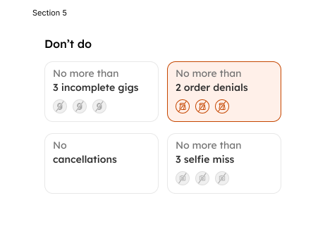
Breach warning indicators
One of the biggest pain points was delivery partners discovering they had breached a condition only after the fact. The new system introduced proactive breach indicators: a visible warning when denial count was approaching the threshold, with a clear explanation of what breach would mean for their earnings.
Copy system
Designed for clarity under pressure
Every state in the offer system had a corresponding piece of copy, designed to be direct, specific, and actionable. Riders had seconds to read and react.
Active offer with incomplete tasks
“Do X gigs and Y orders to unlock Rs Z”
Progress milestone reached
“Rs Z unlocked. Keep going to unlock more!”
Denial count approaching breach
“Don't do any more denials to keep this offer active”
Cancellation count approaching breach
“Don't do any more cancellations to keep this offer active”
Offer completed, explore more
“Congrats! Rs X unlocked. Explore more offers to earn extra”
Offer earned and payout confirmed
“Congrats! Rs X earned. Amount will be credited in the payout”
Breach due to denials
“You have missed Rs X incentive. More than X order denials”
Breach due to incomplete login hours
“You have missed Rs X incentive. Incomplete login hours”
Offer expired without completion
“This offer has expired. Explore other offers to earn extra”
Booking required to keep offer active
“Book X hours between A pm to B pm to keep the offer active”
Marketing and comms
Making the offer understandable before the app could
A redesigned product alone was not enough. Delivery partners had spent months not understanding the old system — a new interface would not undo that overnight. We needed to meet them before they even opened the app.
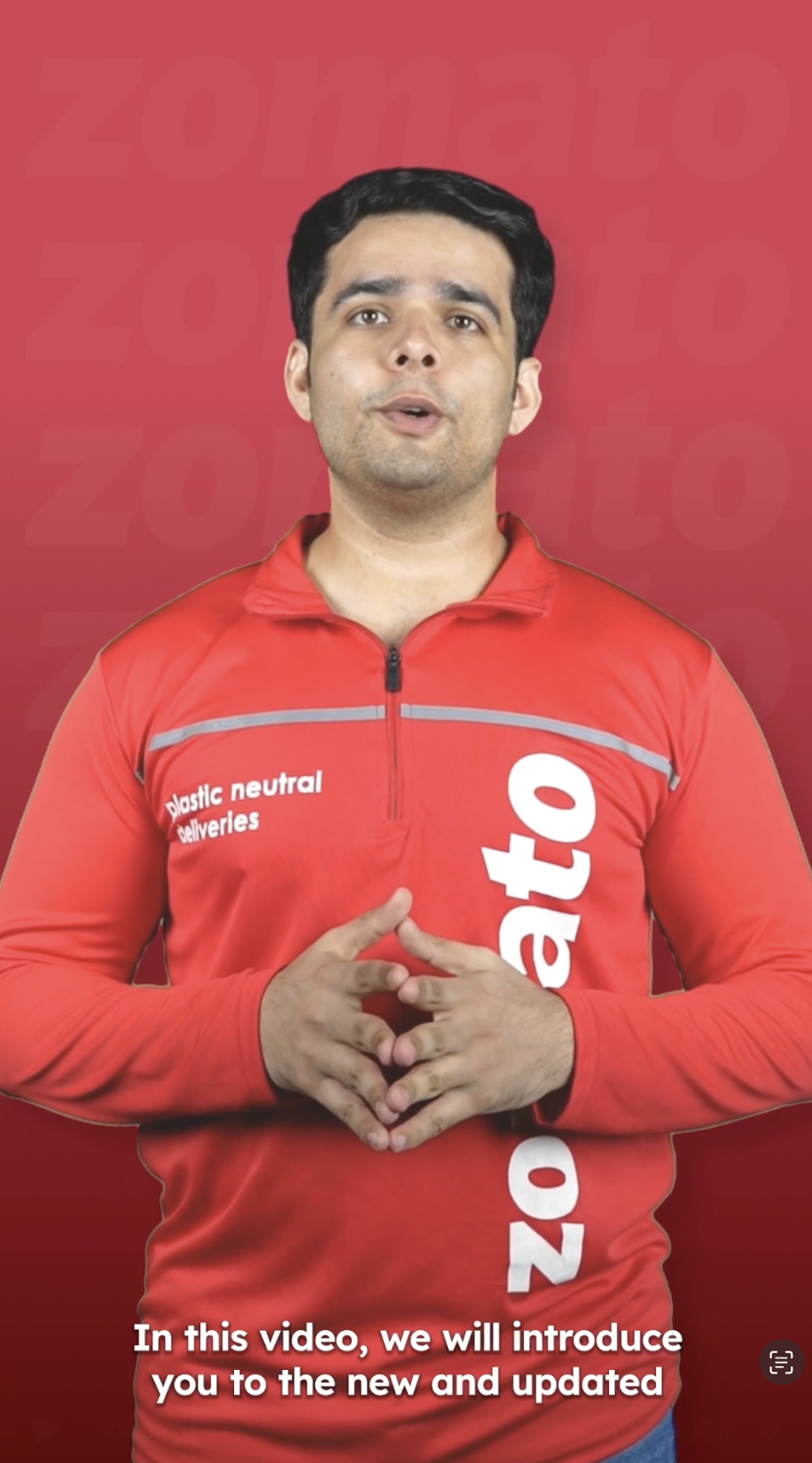
We produced a series of vernacular walkthrough videos in multiple languages, distributed through WhatsApp, push notifications, and embedded directly inside the offer card under a "How this offer works" section. Three types of videos were made: a structured walkthrough of each offer type (GBO, EBO, DI), a conversational peer-to-peer format featuring delivery partners talking to each other about the new system in a relatable, quirky way, and a guided explainer walking one delivery partner through the exact new incentive structure step by step.
Offer walkthrough videos
One per offer type — GBO, EBO, DI — explaining conditions and earnings
Peer conversation videos
Delivery partners talking through confusion in a fun, relatable format
Guided explainer videos
Step-by-step walkthrough of the new incentive structure
Launch
Pilot cities to all India
Pilot approach
- Selected 3 pilot cities with distinct rider profiles
- Ran the new experience in parallel with the old for 2 weeks
- Collected in-app feedback and video testimonials daily
- City ops teams relayed ground observations in real time
- Iterated on copy, layout, and nudge thresholds based on data
- Achieved achievement rate targets in pilot before national rollout
National rollout
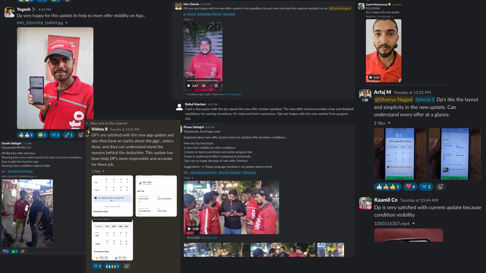
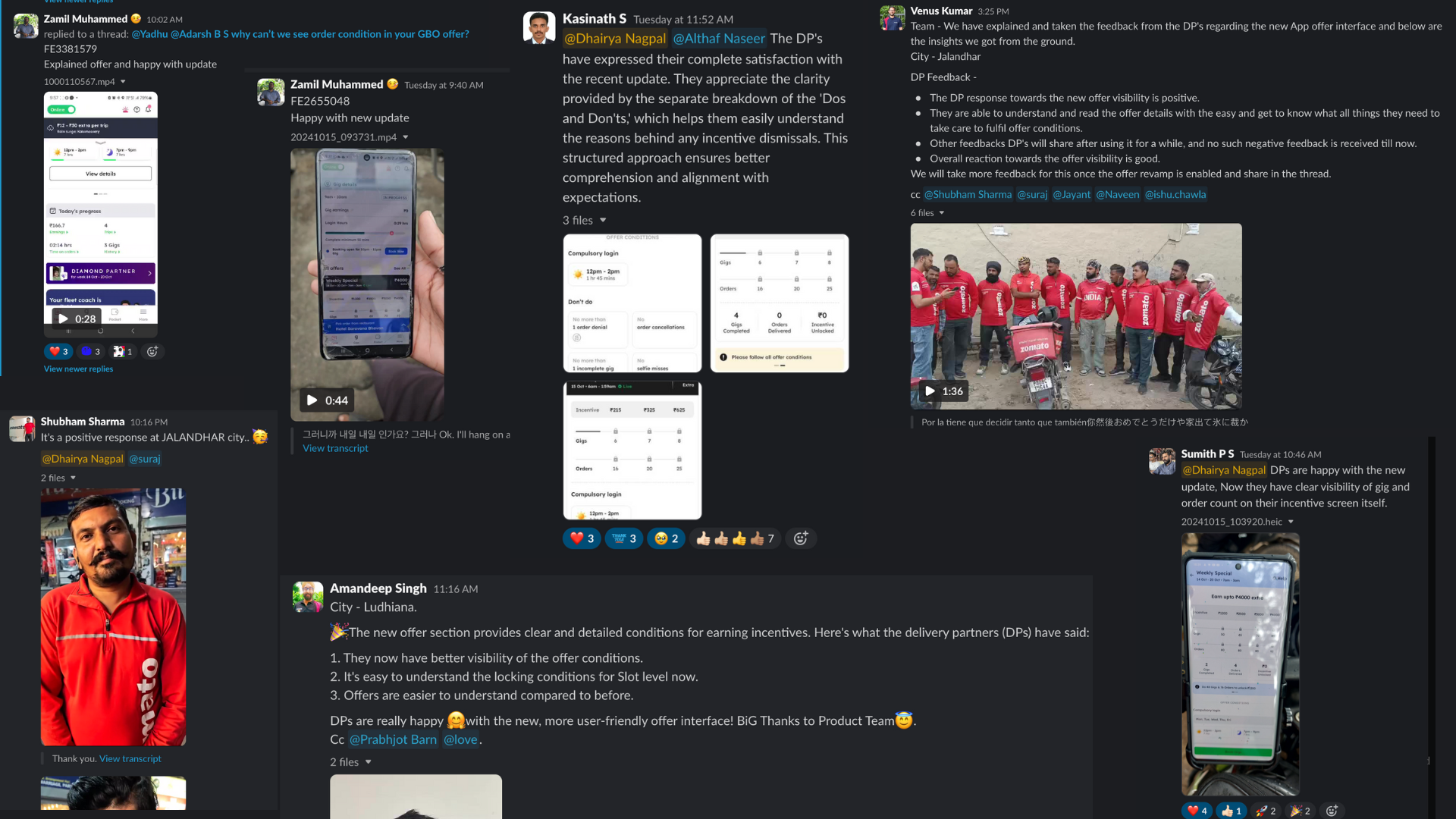
Following successful pilot results, the revamped offer experience was rolled out across all of India in a staged deployment. Each city was monitored individually during the first week of rollout.
The rollout included localisation in all six languages, vernacular audio for every offer type, and tracking dashboards that gave the business real-time visibility into achievement rates, support tickets, and rider sentiment.
Final product
Screens shipped to 6 lakh+ delivery partners
Every screen across the revamped offer experience, as it appeared in production across all of India.
Delivery partner feedback
What delivery partners said
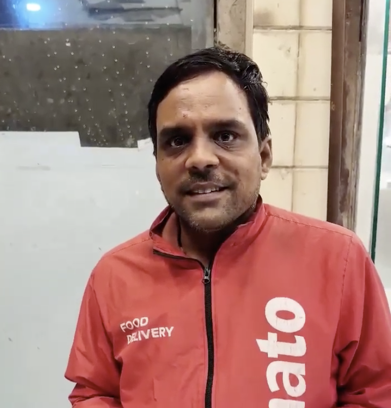
100% positive feedback collected through video interviews and in-person conversations across India.

Feedback screenshots
Impact
What changed
Recognition
Top rider product launch of the year at ZomatoBehind every percentage point in the offer achievement rate is a delivery partner who understood what they needed to do and was motivated to do it.
The hundreds of video feedbacks we received were not just positive sentiment metrics. They were proof that a clear, respectful product experience can change how people feel about their work.
Getting a delivery partner to understand their offer took more than good UX. It took going to the ground, sitting with them, listening to what actually confused them, and building a product that respected both their intelligence and their context.